Creating the 8ninths Logo: Case Study
Following eight years of growth through countless technical advancements, and in welcoming the limitless possibilities of 2017, 8ninths decided to started anew. Here’s a little insight into the internal process for making their new logo come to life. This was a collaboration of the 8ninths design team: Galen Drew, Anna Heatwole, Morgan Kim, and me.
To the Surface
The iceberg metaphor was always at the forefront of each logo version, and was still a guiding philosophy as we looked to the future. So, why the change? The need for an update was self-evident. When putting it to work, the old logo had been giving us some grief.
The problems:
The line weight is too thin, making it appear spindly and illegible at small sizes.
The overall form is very vertical, making it difficult to fit in an often-needed square aspect ratio.
The complexity of the old mark with its irregular, thin lines made it hard to stand out next to simpler, more commanding logos of the industry.
The oldest and the old logo.
New Horizon
Bold and Memorable : Vivid & unique to command attention
Scalable : Legible at all sizes, on all devices and platforms
Stackable : Can be arranged horizontally or vertically
Animatable : Ready to animate online and in virtual space
Dimensional : Reflects our 3-D mindset
Forward-Thinking : Represents our brand goals
With these goals, we were ready to clean up the brand and accurately depict our rising role in the the AR/VR/MR frontier, continuing to keep identify every part of our company spirit: Technical, Experimental, Vibrant, Human, Clever. We started interpreting our brand values by gathering visual inspiration, and audited other logos from the industry to identify the sweet-spot that we would be shooting for.
Moodboard
Process & Perspectives
ROUND 1
We had many sketching parties and visual brainstorms, keeping this first round on paper. Together we imagined hundreds of ways to create an iceberg in two dimensions from the ultra abstract to the more illustrative. Our dozens of pages of sketches worked as a solid jumping off point.
ROUND 2
The team eventually zoomed in on the more promising ideas, landing where we felt there was a little mystery and a lot of heft. As concepts developed, we vectorized them to see what we were really working with.
Feedback from leadership was that things were a bit plain. Concepts were interesting, but the implementation was not yet hitting the mark.
ROUND 3
Knowing we needed a new approach to representing space, the team generated ways of creating an iceberg in the most simplified 3d geometries possible. With direction from Adam, we took inspiration from the Platonic forms, viewing intersecting planes and shapes from many different angles. Maya proved to be the most useful tool for this spatial exploration.
By breaking our efforts out of the two-dimensional spaces of pencil/paper & vector forms, we were finally able to crack the code.
Crafting the Final
As we had finally finalized our iceberg, it was time to implement the type treatment. Initially, we explored friendly san-serifs in round ratios, progressing later to typefaces with more unexpected character.
After playing around we decided that a custom-built monospace approach was what was really needed. All caps creates a nice balance between letters, avoiding the sometimes clumsy letterform cadence we we ran into with sentence case varieties. Tailored letterforms create the right balance of specialty and stability while reflecting the geometric symmetry of the mark.
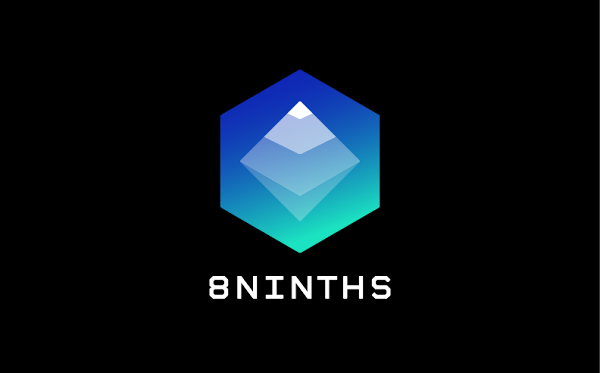
We love the outcome. Transparent layers of the iceberg recede into an illuminated blue-green gradient glow within the water cube, while a white peak emerges from its enclosing shape. With this new mark for our namesake fraction, we welcome you to the new 8ninths.


